
MOBILE APP DESIGN: IN BLOOM
A mock app for Google’s UX Design course.
Timeline:
Three months (2022)
My role:
UX Designer
Deliverable:
Mobile App
Platform:
Figma
Project Overview
The product:
In Bloom is a new floral catalogue app that allows you to purchase orders online and schedule the delivery in advance. Focusing on current, trendy and modern products, In Bloom has the best collection of curated unique and fresh florals.
The problem:
Busy professionals need to order flowers and get them delivered quickly.
The goal:
Design an app that allows users to easily place floral orders and schedule deliveries in advance.
Understanding the Users
After conducting the competitive analysis, I started the interviewing process. Through asking people in my community about their motivations behind purchasing flowers, I was able to determine that people purchase flowers on a need-basis vs want-basis. I discovered the following pain points when people purchase flowers:
Can’t find exactly what they’re looking for.
Don’t have the time to pick up flowers and deliver them.*
Place the same orders quickly each time.*
Can’t place same-day deliveries.
*I incorporated the insights into two user personas and for the sake of this case study, I will just be focusing on the one below.
Carlos
Age: 45 years old
Location: New York, NY
Education: College Degree
Hometown: New York, NY
Family: Married with two teens
Occupation: Small business owner
Bio
“I have a billion things on my mind, but those around me come first.”
Carlos is a small business owner of a high-end lifestyle store in the middle of a busy metropolitan area - his lifelong dream since he immigrated to NY from El Salvador when he was a teen. He puts a lot of work into making sure his store feels like an experience. Each week, he purchases unique and exotic flowers for the “selfie wall,” which has begun to be a big draw for attracting new customers, thanks to Instagram & Tik Tok influencers. He wants to keep this reputation up so it’s important the flowers are in pristine condition. He’s constantly on the go and doesn’t have much time to spare.
Goals
Carlos needs to purchase the same high-quality and fresh flowers every week, ensuring that he can rely on getting them delivered to his store.
Frustrations
Carlos is frustrated about having to search and find the products each time he places an order and wishes he could order the products quickly at once. He also doesn’t have the time to pick the flowers up.
Carlos’ User Journey
Purchasing flowers should be a pleasant experience and for a busy person like Carlos, placing orders on outdated websites that don’t offer delivery is frustrating and can even add stress to their day. The In Bloom app aims to make this all seamless for users.
Ideation

Through conducting exercises like time sketches, Crazy 8’s, and storyboarding, I began by focusing on Carlos’ frustrations around searching for the same products each week.
I landed on creating a ‘Your Favorites’ page. The app would be ungated, but to access this page, they would need to have an account and log in.
Once users are logged in, they can easily access their favorite items in one area, saving them time from searching for products.
I translated the paper wireframes into a digital low-fidelity prototype and conducted a usability study with five users.
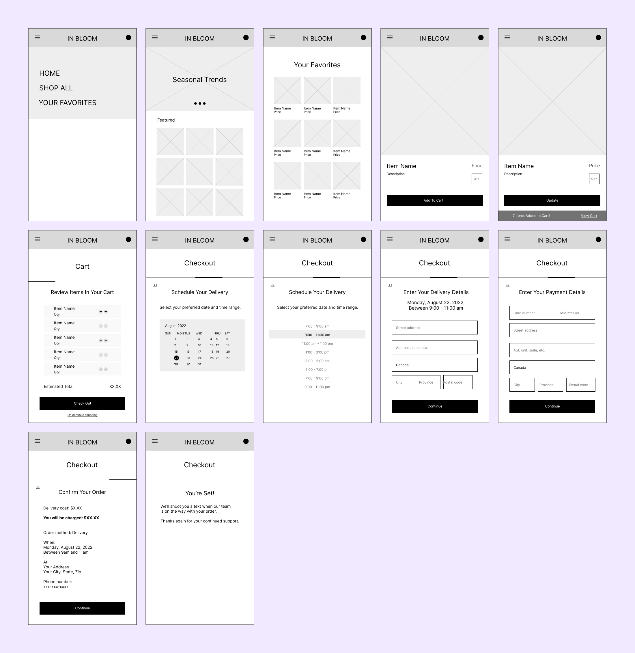
Check out the first draft of the low-fidelity prototype.
Usability Studies
Between the low-fidelity and high-fidelity prototypes, I conducted two rounds of usability studies to find out whether users actually save time by using our app to place their orders and schedule deliveries. Using Miro, I synthesized the data via affinity diagraming.

I made the following improvements based on user feedback.
1) One-click ‘Add All Favorites’ button to the cart
Previously, users had to select each item to add them to the cart. In the usability studies, 3/5 people found this cumbersome. Now, users also have the option to add all items to the cart in one click, saving them even more time.
2) Two-column layout for better browsing and scrolling experience
4/5 people mentioned that the product images were too small. The two-column layout allows for more white space, increased scrolling experience, and breathing room and portrait-sized images to match the vertical orientation of most flowers.
3) Delivery - scheduling date and time.
3/5 people mentioned the checkout flow was easy and quick, but I noticed they stalled while scheduling the delivery. When asked, they divulged that there were too many CTAs that distracted them from the primary action. I cleaned up the design and flow so that users can focus on the main action.
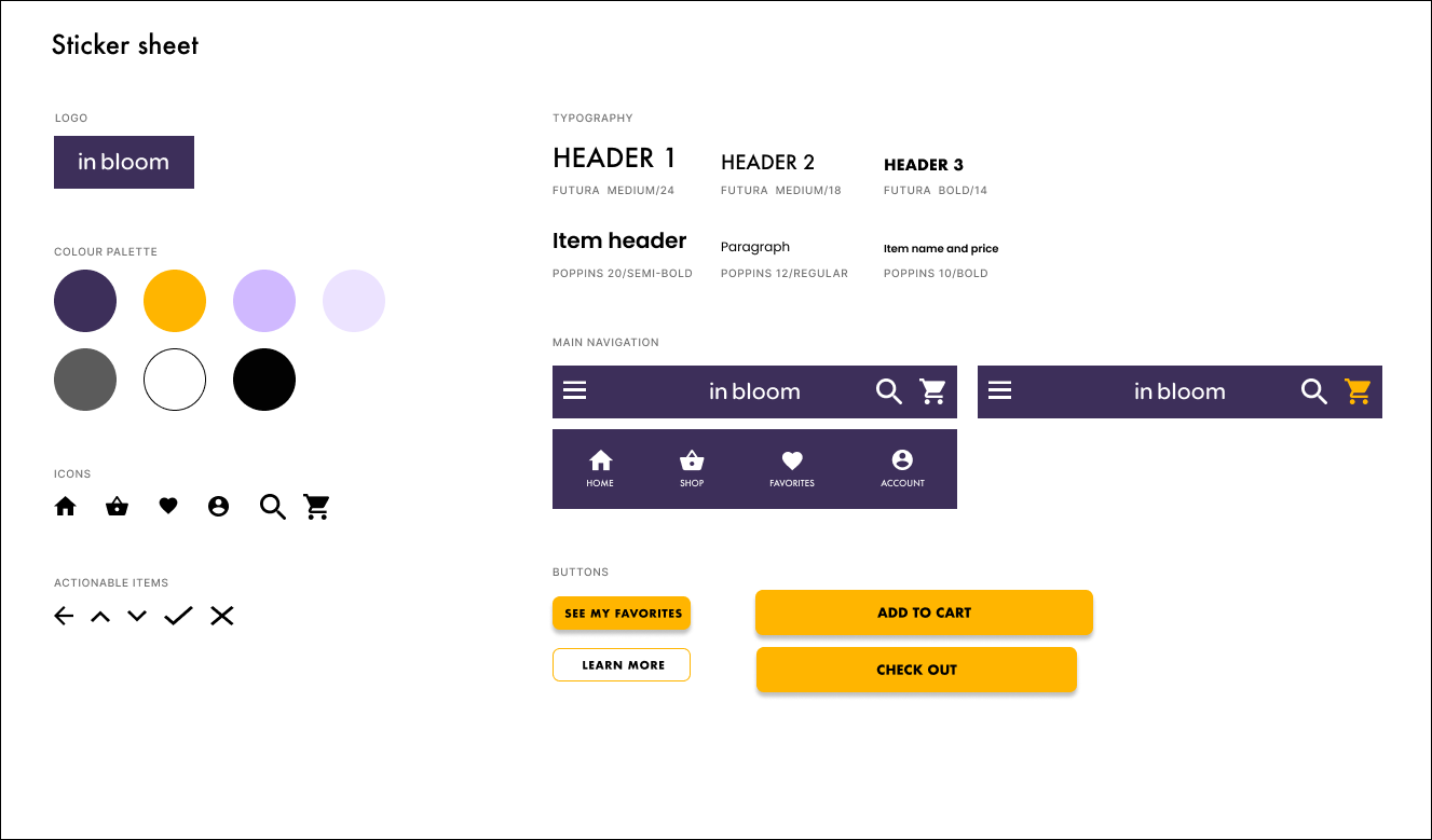
Design System
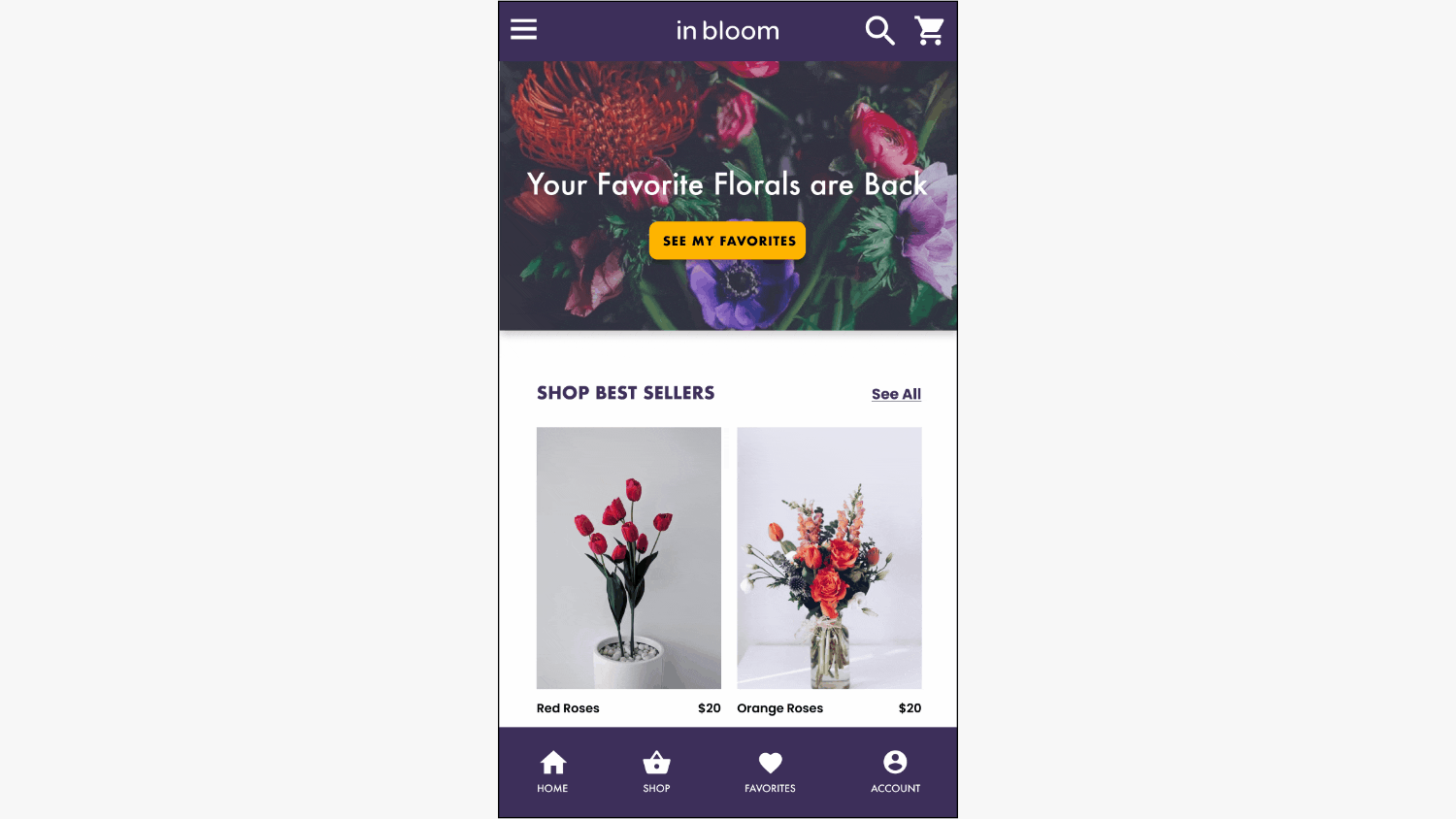
High-Fidelity Prototype
Reception
The usability study participants all shared positive feedback when they perused the high-fidelity prototype. Everyone seemed to love the aesthetic, color palette, and ease of the overall experience.
“The ‘In Bloom’ App is soooo pretty!! There are so many shopping apps out there are so annoying and hard to use, but this one is really simple and clear to use.”
-ERIN R., USABILITY STUDY PARTICIPANT
What I Learned
Throughout the project, I’ve learned best practices and resources to ensure that the user is fully centred during the entire time. Because the design decisions were grounded in actual data from the usability studies, problem-solving was a bit of a quicker and simpler process.
As well, ensuring that accessibility is factored in right from the get-go also made design decisions easier later on.
Next Steps
Build out the user flow for “favoriting” items
Build out the user flow for Accounts
Keep refining the Search functionality
Build the Delivery Tracking feature

