
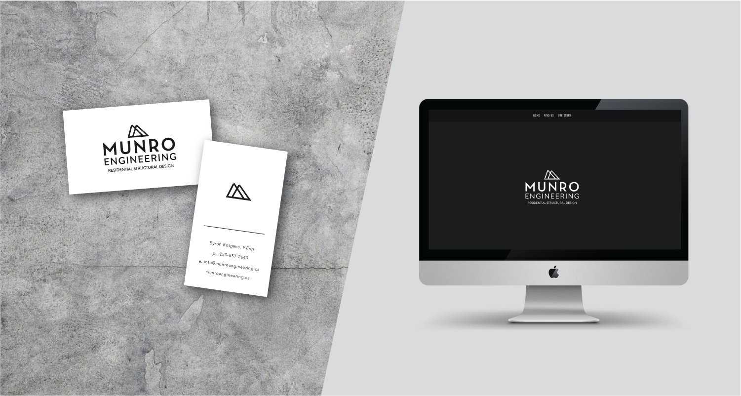
BRAND IDENTITY & WEB DESIGN: MUNRO ENGINEERING
Timeline:
One month (2018)
My role:
Designer
Deliverable:
Branding & logo design, responsive website, business cards
Platform:
Adobe Illustrator, Squarespace
Goal
Reflect Munro’s characteristics of strength, integrity, and collaboration with a modern, west coast and approachable feel.
Process
Byron came prepared with a few sketches he had in mind. The initial pathway of the design process was an obvious route: make the ‘M’ in Munro fit into the shape of a mountain peak. What came to fruition felt generic, boring, and didn’t encapsulate the company’s strength in a way that spelled ‘modern, west coast, and approachable.’

I studied various steel structures and landed on the use of geometry within the discipline. The analysis rooted me back into my number one principle as a designer: keep it simple. So, I incorporated the ‘M’ into a basic frame instead. 100% black suddenly felt too commercial, so I knocked it back to 95%… funny what a 5% colour variance can do!

“The business is going really really well and clients like the graphic design. I have enjoyed the professionalism your graphic design has brought to my company. Thus, Thank you again for that.”
-Byron